The 2020 Emily Griffith Technical College Brand Guidelines introduces you to the new logo, what it means, and how to use it properly in communications materials. This document presents flexible and easy tools that you can use to ensure the logo is presented with strength and consistency. These guidelines are the cornerstone of all communications efforts and must be followed to ensure a consistent style and quality of presentation. Please use these guidelines to ensure Emily Griffith’s new brand identity is always reflected in our integrated communications efforts.
Emily Griffith Logo and Usage
The Emily Griffith logomark and the logotype. These elements should never be changed. Position, size and color, along with the spatial and proportional relationships of the Emily Griffith logo elements, are predetermined and should not be altered. Used consistently, they will reinforce public awareness of the college.
The logo utilizes circular and diagonal lines to create an icon that not only
incorporates the name of the school, but also demonstrates the complexity of the programs offered by the school. The design emphasizes pathways to success that reveal a positive trajectory. In addition, the design captures the preferred brand traits (accessible, dynamic, friendly, progressive and realistic) that were identified in the 2020 brand survey. The logo should always be used in its complete form with the wordmark “Emily Griffith Technical College.”
Logo:![]() | |
LogoMark:![]() | |
Logotype: |
Clear Space
The Emily Griffith Technical College logo requires separation from the other elements surrounding it. The space required on all sides is exactly half of the height of the logo. The logo must always fit into a clear space area and should never contain other graphical elements, which would hinder the brand.
Please note that text or pictorial figures that have a strong impact or impression should not be placed near the logo even if you keep the isolation area blank.
CLEAR SPACE EQUALS HALF OF THE LOGOMARK
Minimum Logo Sizes
For the logo mark, the minimum size is 1.25 inches wide. For the icon, the minimum size is .5 inches wide. Scale and proportion should be determined by the available space, function and visibility of the clear space.

One Color (Dark)
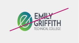
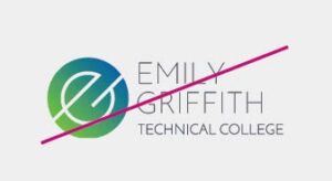
The two-color, gradient logo is the preferred logo. However, one-color variations can be used on colored backgrounds based on the expanded color palette or official photography. Backgrounds are required to provide sufficient contrast for logo legibility.

One Color (Light)

Improper Logo Treatments
The logo must remain intact as described in this document and must not be manipulated in any way. This practice ensures brand integrity and consistency. Do not present the logos below the minimum sizes provided on the previous pages. Make sure to use the appropriate amount of spacing around the logos as well. If you are using the old logos in your department or office, please contact Communications@emilygriffith.edu to work on a plan to implement the current visual identity.
![]() | ![]() |
![]() | ![]() |
![]() | ![]() |
Emily Griffith Typography
Typefaces provide visual “voices,” each with a different personality, density and texture, which can help promote and advance the Emily Griffith Technical College brand.
Primary Typeface: Josefin Sans
Is an elegant, geometric, vintage typeface meant to be used at larger sizes. It pairs well with Cardo, Abril Fatface, Yeseva One, Lato and Playfair.

Josefin Sans is available to download for free via fonts.google.com. In print, Josefin Sans SemiBold is used for headlines and Josefin Sans Light is used for body text. On the web, Josefin Sans SemiBold is used for headings, but Lato is preferred for body text. The system alternative typeface for Microsoft Office programs is Century Gothic. To create a more unified brand, departments and offices are required to adopt the new typography for primary communications.
Primary Typeface Weights

Secondary Typeface: Lato
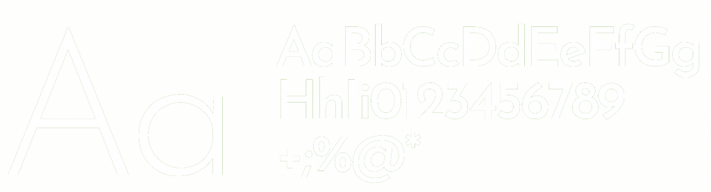
Lato is a humanist sans-serif typeface designed by Łukasz Dziedzic. It was released in 2015. The name “Lato” is Polish for “summer”. As of August 2018, Lato is the third most used font on Google Fonts.

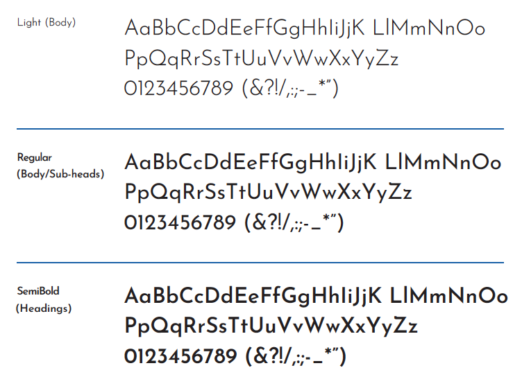
Lato Sans is available to download for free via fonts.google.com. Lato’s primary use is on the web and digitally. It is only used in place of Josefin Sans in print for large sections of text when legibility is a concern. The system alternative typeface for Microsoft Office programs is Calibri Light. To create a more unified brand, departments and offices are required to adopt the new typography for primary communications.
Secondary Typeface Weights

Emily Griffith Color Palette
To create a more unified brand, departments and offices are required to adopt the new color palette.
Primary Color System
The following palette has been selected for use in Emily Griffith Technical College communications. Lighter tints of these colors are also allowed., but the logotype + background may only be used with a 100% tint. A comprehensive color palette has been developed to provide flexibility while creating a unified, recognizable appearance across all communications.

Gradient
The diagonal movement of the gradient within the logo exemplifies progress, showing that attending Emily Griffith Technical College transforms students’ lives. When utilizing the gradient, it’s important to maintain the same diagonal direction from green to blue at 45 degrees, with the middle of the gradient coinciding as closely with the middle of the shape as possible.

Tints
Tints can be used as necessary
When using the Emily Griffith Technical College color palette, tints enable versatility and cohesiveness. A variety of shades can be used to achieve flexibility while staying true to the brand.

Emily Griffith Sample Collateral
New collateral may be ordered online through the Communications & Marketing Department. An email signature template will also be available through the Communications & Marketing Department to create consistency in digital communications. Stationary, business cards and other templates can be ordered through our preferred vendor, Ricoh. Please reach out to Debbi Grieve for more information on ordering.


Email Signatures

The Imagery and Color Effects
The Imagery
Use official photos for creating materials that reflect the authentic Emily Griffith Technical College brand. Our official photos will help you create effective and compelling messages, and will ensure that our visual identity and communications are consistent. You can obtain photos from the Communications & Marketing Department.
Photos are available for both high-resolution and digital screen presentation downloads.
The imagery direction should follow these guidelines:
- Be in first-person perspective
- Have compelling storytelling
- Demonstrate the heart and soul of the institution
- Show humanity
- When demonstrating action, it should be wide-angled and with a first-person perspective
- Always demonstrate diversity, inclusivity and equity

![]() | ![]() |
If you use a color photo, make sure the photo is not oversaturated. Ideally the saturation should be reduced by 10-15%. | Another photo treatment is to use our gray color layer at 90% transparency. |
Iconography
Our Icons
Our program icons are an important part of our visual communications and are used to identify Emily Griffith Technical College’s diverse offerings. The icons can be used individually on promotional items that feature a specific program, or they can be used together to showcase the breadth of programs the college offers.


Zoom Backgrounds
![]() | ![]() |
![]() | ![]() |
Thank You Card

Download Thank You Card (JPEG)
Newsletter/Flyer Template

Download Newsletter/Flyer Template